前端开发
使用CSS repeating-conic-gradient实现炫酷的边框动效
repeating-conic-gradient CSS 函数创建一个由重复渐变(而不是单个渐变)组成的图像,其颜色过渡围绕中心点旋转(而不是从中心辐射)

• 3分钟
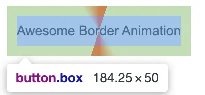
先创建一个按钮元素,使用repeating-conic-gradient语法给按钮添加一个重复圆锥渐变背景的图像。得到如下效果按钮:
代码示例如下:
<button class="box"> Awesome Border Animation </button>
.box {
  padding: 10px;
  height: 50px;
  border: none;
  outline: none;
  background: repeating-conic-gradient(#ff2700 0%, #ff2700 5%, transparent 5%, transparent 40%, #ff2700 50%);
}
给button元素加上animation动画,启用需要用到@property自定义一个angel属性,然后使用animation keyframes让background的动画帧动起来。
@property --angle {
  syntax: '<angle>';
  inherits: false;
  initial-value: 0deg;
}
.box {
  padding: 10px;
  height: 50px;
  border: none;
  outline: none;
  background: repeating-conic-gradient(
    from var(--angle),
    #ff2700 0%,
    #ff2700 5%,
    transparent 5%,
    transparent 40%,
    #ff2700 50%
  );
  animation: animation 4s linear infinite;
}

.box::after {
  position: absolute;
  content: '';
  inset: 4px;
}
@keyframes animation {
  0% {
    --angle: 0deg;
  }
  100% {
    --angle: 360deg;
  }
}
实现了如下效果:
给按钮元素添加::after伪元素,添加背景以及边框,同时给按钮元素添加z-index层级,让其层级高于after伪元素。
.box::after {
  content: '';
  position: absolute;
  inset: 3px;
  background: #232323;
  border: 2px solid #232323;
  z-index: -1;
  border-radius: 12px;
}
.box {
padding: 10px;
  height: 50px;
  border: none;
  outline: none;
  background: repeating-conic-gradient(
    from var(--angle),
    #ff2700 0%,
    #ff2700 5%,
    transparent 5%,
    transparent 40%,
    #ff2700 50%
  );
  animation: animation 4s linear infinite;
  /* some extra css property */
  color: #fff;
  position: relative;
  z-index: 0;
  border-radius: 12px;
}
<template>
  <div>
    <button class="box">Awesome Border Animation</button>
  </div>
</template>

<script setup lang="ts"></script>

<style scoped>
  @property --angle {
    syntax: '<angle>';
    inherits: false;
    initial-value: 0deg;
  }

  .box {
    padding: 10px;
    height: 50px;
    border: none;
    outline: none;
    appearance: none;
    background: repeating-conic-gradient(
      from var(--angle),
      #ff2700 0%,
      #ff2700 5%,
      transparent 5%,
      transparent 40%,
      #ff2700 50%
    );
    animation: animation 4s linear infinite;
    color: #fff;
    position: relative;
    z-index: 0;
    border-radius: 12px;
  }

  .box::after {
    content: '';
    position: absolute;
    inset: 3px;
    background: #232323;
    border: 2px solid #232323;
    z-index: -1;
    border-radius: 12px;
  }

  @keyframes animation {
    0% {
      --angle: 0deg;
    }
    100% {
      --angle: 360deg;
    }
  }
</style>
还可以在::before伪元素上添加与按钮元素相同的圆锥渐变背景图像,实现更加有趣的动效